


Graphic Design Basics for Beginners


Graphic design is everywhere. It's in the logo on your coffee cup, the menu at your favorite restaurant, the packaging on a product, the social media posts you scroll past, and the website you're visiting right now.
If you've ever looked at a poster, invitation, presentation, or social media graphic and thought, "I wish I could make something like that," you already have a good reason to start learning graphic design.
The good news is that you don't need to be an artist or have years of design experience. Graphic design is less about being able to draw perfectly and more about learning how to arrange words, images, colors, shapes, and space so they communicate an idea clearly.
You can start with simple projects, experiment with different design tools, and gradually develop an eye for what works and what doesn't.
Whether you want to create graphics for your own projects, explore a new creative hobby, or eventually pursue design professionally, understanding a few basic principles will give you a strong foundation.
What Is Graphic Design?
Graphic design is the process of combining visual elements to communicate information or an idea.
Those elements might include:
Typography
Photographs
Illustrations
Colors
Shapes
Icons
Patterns
Logos
White space
Layouts
A graphic designer might create a business logo, magazine layout, product label, website graphic, poster, book cover, advertisement, presentation, or social media image.
The goal isn't simply to make something attractive.
Good design helps people understand what they're looking at and know where to focus their attention.
You Don't Have to Be Good at Drawing
One of the biggest misconceptions about graphic design is that you need strong traditional art skills.
While illustration can certainly be part of graphic design, many designers rarely draw by hand.
Graphic design is largely about visual communication.
You might arrange photographs and text for a magazine page, create a clean business card, develop a social media graphic, or design a presentation without drawing anything at all.
If you're comfortable experimenting with shapes, fonts, colors, images, and layouts, you already have many of the skills you need to begin.
Start With Simple Design Tools

You don't need expensive professional software on your first day.
There are many tools that beginners can use to experiment with graphic design.
Canva
Canva is particularly beginner-friendly because it offers templates and a drag-and-drop interface.
It's useful for creating:
Social media graphics
Invitations
Flyers
Presentations
Posters
Simple logos
Pinterest graphics
Business cards
Templates can be helpful while you're learning because you can see how experienced designers arrange different elements.
Don't simply replace the text in a template and call it finished, though. Study the layout and ask yourself why certain elements were placed where they were.
Adobe Express
Adobe Express provides another accessible way to create graphics using templates, images, text, and design elements.
It's useful for quick projects and can be a comfortable starting point if you're interested in eventually exploring Adobe's more advanced creative tools.
Adobe Photoshop
Photoshop is widely used for image editing and many types of graphic design work.
It can be used for tasks such as:
Photo editing
Compositing
Digital artwork
Advertising graphics
Web graphics
Image manipulation
Photoshop has a much steeper learning curve than beginner-focused design tools, so don't feel like you need to master everything immediately.
Adobe Illustrator
Illustrator is particularly important for creating vector graphics.
It's commonly used for:
Logos
Icons
Illustrations
Infographics
Packaging
Typography-based designs
A major advantage of vector graphics is that they can be scaled to different sizes without losing quality.
Affinity
Affinity's creative software has also become popular with people looking for professional-level design tools.
Depending on your needs, Affinity can provide tools for graphic design, photo editing, and page layout.
The important thing isn't which software you choose.
It's learning how to make good design decisions.
*As an Amazon affiliate I earn from qualifying purchases.
Learn the Basic Elements of Design
Before worrying about complicated software techniques, become familiar with the basic building blocks of design.
These include:
Line
Shape
Color
Texture
Space
Form
Typography
Imagery
You don't need to memorize definitions.
Instead, pay attention to how these elements work together.
A simple poster might use a large rectangle as a background, bold typography for the title, a photograph as the focal point, and generous empty space around everything else.
That's graphic design.
Understand Visual Hierarchy
Visual hierarchy determines what people notice first, second, and third.
Imagine a restaurant menu.
You might want the restaurant name to be noticed first, the category headings next, and individual dishes afterward.
You can create hierarchy by changing:
Size
Weight
Color
Position
Contrast
Spacing
A large headline naturally attracts more attention than a small paragraph.
If everything on a page is equally large, bold, and colorful, nothing feels particularly important.
Good design guides the viewer's eye.
Start With One Main Focal Point

Before designing something, ask yourself:
What do I want people to notice first?
Maybe it's the headline.
Maybe it's a photograph.
Maybe it's a product.
Maybe it's a date for an event.
Give that element the strongest visual emphasis.
Then arrange the other elements so they support it.
For example, if you're creating a concert poster, the band's name might be the largest text, while the date, location, and ticket information are smaller.
This makes the information easier to process.
Learn About Balance
Balance refers to how visual weight is distributed throughout a design.
A design can feel balanced even when the elements aren't perfectly symmetrical.
There are several ways to create balance.
Symmetrical Balance
Both sides of a design are similar.
This can create a feeling of order and stability.
Asymmetrical Balance
Different elements are balanced against each other even though they aren't identical.
For example, a large photograph on one side might be balanced by a smaller headline and several lines of text on the other.
Asymmetrical layouts can feel more energetic and modern.
Use Alignment
Alignment is one of the simplest ways to make a design look more professional.
Text and images shouldn't appear to be randomly placed.
Look for invisible lines.
Should several headings line up along the same left edge?
Should an image align with the text beneath it?
Should the edges of different blocks of information share a common boundary?
Small alignment decisions can make a major difference.
Learn About White Space
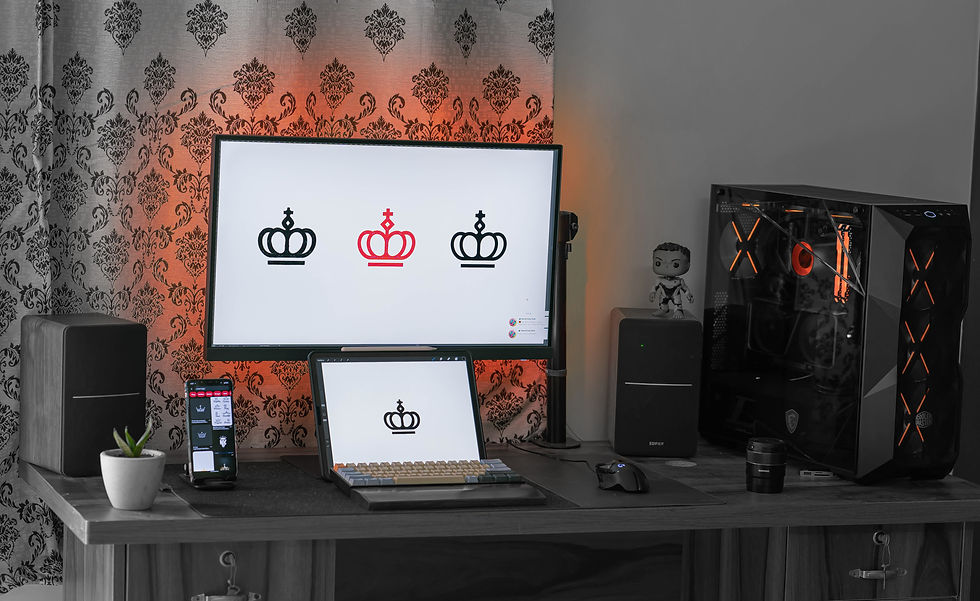
White space, sometimes called negative space, is the empty area around design elements.
Beginners often think empty space means something is missing.
Usually, the opposite is true.
White space gives the viewer room to process information.
Imagine a flyer packed with five photographs, six different fonts, multiple colors, and text filling every corner.
Now imagine the same flyer with one strong photograph, a clear headline, a short description, and plenty of space around the elements.
The second version will probably feel much easier to understand.
Don't be afraid to leave areas empty.
Choose Fonts Carefully
Typography is one of the most important parts of graphic design.
The font you choose can change the personality of an entire design.
A formal invitation might use an elegant serif typeface.
A children's poster might use something playful.
A technology company might use a clean sans-serif font.
The possibilities are enormous.
But more fonts don't necessarily mean better design.
Limit Your Font Choices
For many beginner projects, two fonts are plenty.
You might use one font for headlines and another for body text.
You can also use different weights of the same font family to create hierarchy.
Using five or six unrelated fonts can quickly make a design look chaotic.
Understand Serif and Sans-Serif Fonts
Serif fonts have small decorative strokes at the ends of letters.
They can create a traditional, editorial, or sophisticated feeling.
Sans-serif fonts don't have those strokes and often feel cleaner and more modern.
Neither is automatically better.
Choose based on the mood and purpose of the project.
Pay Attention to Readability
A beautiful font is useless if nobody can read it.
Make sure there's enough contrast between your text and its background.
Avoid placing small text over a busy photograph.
Don't make paragraphs extremely narrow or extremely wide.
Be particularly careful with decorative fonts.
They can look great in a headline but become difficult to read when used for an entire paragraph.
Learn Basic Color Theory

Color is another major part of graphic design.
You don't have to become a color expert, but learning a few basic concepts can help you make better choices.
A color wheel can help you understand relationships between colors.
Some common combinations include:
Complementary colors: Colors positioned opposite each other on the color wheel.
Analogous colors: Colors positioned next to each other.
Monochromatic colors: Different shades, tints, and tones of a single color.
Each approach creates a different mood.
Don't Use Too Many Colors
Beginners often get excited about color and use every shade they like.
Try starting with a smaller palette.
For example, you might choose:
One primary color
One secondary color
One accent color
White, black, or neutral shades
A limited palette often creates a more cohesive design.
Use Contrast
Contrast helps different elements stand apart.
You can create contrast through:
Light and dark colors
Large and small text
Thick and thin fonts
Large and small images
Different shapes
Different textures
For example, a large black headline on a white background has strong contrast and is easy to notice.
Contrast helps establish hierarchy and prevents the design from looking flat.
Think About Repetition
Repeating visual elements creates consistency.
You might repeat:
A particular color
A font
A shape
A border style
A spacing pattern
An icon style
This is especially important when creating multiple graphics for the same brand or project.
If every social media graphic looks completely different, an audience may have trouble recognizing that they came from the same organization.
Create Consistency

Designers often talk about visual consistency because it helps create a recognizable identity.
A business might use the same:
Logo
Color palette
Typography
Photography style
Graphic elements
across its website, business cards, packaging, and social media.
You don't have to create a full brand identity to practice this.
Try designing three social media graphics for the same imaginary business.
Use the same fonts and colors but change the content.
You'll start to understand how a visual system works.
Learn About Grids
A grid is an invisible framework used to organize elements on a page.
You may not see it, but it can help you decide where things belong.
Magazine layouts, websites, brochures, and presentations often rely on grids.
As a beginner, you can create a simple grid with columns and rows.
Then align your text and images to it.
Grids can make designs feel more organized without making them boring.
Use Images Thoughtfully
If you're using photographs in your designs, choose images that support the message.
A high-quality photograph isn't automatically the right photograph.
Think about:
Composition
Lighting
Subject matter
Color
Orientation
Cropping
If you're designing a travel graphic about Italy, for example, a beautiful photograph of a recognizable landmark may work better than a generic vacation photograph.
The image should contribute something to the design.
Learn How to Crop Photos

Cropping is a simple skill that can dramatically change an image.
You might crop tightly around a person's face to create emphasis.
You might remove distracting objects from the edges.
You might change a horizontal photograph into a vertical composition.
Don't automatically assume you need to use an entire photograph.
Sometimes the strongest design uses only part of an image.
Be Careful With Stock Images
If you're creating designs for yourself, a blog, or a business, don't simply download random images from search results.
Many images are protected by copyright.
Use photographs you created yourself or obtain images through reputable sources with licensing that permits your intended use.
Pay attention to whether attribution is required and whether commercial use is allowed.
Learn the Difference Between RGB and CMYK
This can sound technical, but it becomes important if you plan to print your designs.
RGB stands for red, green, and blue and is generally used for screens and digital graphics.
CMYK stands for cyan, magenta, yellow, and key (black) and is commonly used for print production.
If you're creating an Instagram graphic, you're primarily concerned with digital display.
If you're designing a brochure that will be professionally printed, you'll need to think about print specifications, including color mode and file format.
Understand File Formats
Different projects require different file types.
JPG: Common for photographs and many digital graphics.
PNG: Useful when you need transparency or want to preserve certain types of image detail.
SVG: A vector format commonly used for scalable graphics such as logos and icons.
PDF: Frequently used for documents and print-ready designs.
PSD: Photoshop's native file format.
AI: Illustrator's native file format.
You don't need to memorize all of these immediately.
Just understand that the best format depends on how the design will be used.
Design for the Correct Size

A common beginner mistake is creating a design without considering where it will be used.
A social media post, business card, website banner, poster, and phone wallpaper all have different dimensions.
Before starting, determine the final size.
If you're designing for print, also consider resolution, bleed, margins, and the printer's requirements.
Starting with the correct dimensions saves you from having to rebuild your design later.
Don't Forget Margins
Keep important text and graphics away from the edges of your design.
This is especially important for printed materials.
Even when you're designing something digitally, generous margins can make the composition feel cleaner.
Think about the edge of your design as a boundary.
Give the content some breathing room.
Start With a Sketch
You don't have to begin every design directly on a computer.
Grab a pencil and quickly sketch several possible layouts.
Draw rectangles to represent photographs.
Use lines to represent text.
Try different arrangements.
You don't need artistic skill.
You're simply figuring out where the elements might go.
Spending five minutes sketching can save you twenty minutes of rearranging things digitally.
Look at Good Design
One of the fastest ways to improve is to pay attention to design everywhere.
Look at:
Magazine covers
Book covers
Restaurant menus
Packaging
Websites
Posters
Advertisements
Movie posters
Album covers
Social media graphics
Instead of simply deciding that something "looks good," ask yourself why.
Where does your eye go first?
Why?
How many fonts are being used?
What colors are repeated?
How much empty space is there?
How are the images positioned?
This turns everyday observation into design practice.
Recreate Designs for Practice

A useful learning exercise is to recreate an existing design for practice.
Choose a poster, social media graphic, or simple advertisement you admire.
Try to reproduce its layout using your own tools.
This doesn't mean copying someone else's work and presenting it as your own.
The goal is to understand the decisions behind the design.
You might discover that the designer used a simple grid, only two fonts, and three colors.
What initially looked complicated may actually be quite simple.
Start With Small Projects
You don't need to design a complete magazine to practice.
Try creating:
A motivational quote graphic
A book cover
A concert poster
A birthday invitation
A restaurant menu
A podcast cover
A simple business card
A travel postcard
A fictional product label
A social media post
Small projects let you practice one skill at a time.
Create a Fictional Brand
One particularly fun exercise is to invent a fictional business.
Maybe it's a coffee shop, flower store, bookstore, yoga studio, bakery, or travel company.
Give it a name.
Choose a color palette.
Pick two fonts.
Design a logo.
Then create a business card, social media graphic, and simple advertisement.
Because the brand is fictional, you can experiment without worrying about whether you're making the "right" decision.
Avoid the Beginner Trap of Overdesigning

When you're learning, it's tempting to add everything.
More colors.
More fonts.
More icons.
More patterns.
More effects.
More photographs.
Try doing the opposite.
Remove something.
Then remove something else.
Ask yourself whether every element has a purpose.
If a design communicates the message clearly without an extra decorative element, you may not need it.
Simple doesn't mean boring.
Don't Rely Too Heavily on Templates
Templates are useful learning tools, especially when you're just starting.
But don't become dependent on them.
Instead of always choosing a template and replacing the words, start changing the structure.
Move the photograph.
Change the font hierarchy.'
Adjust the spacing.
Try a different color palette.
Eventually, create your own layouts from scratch.
That's when you'll begin developing your own design instincts.
Learn to Take Constructive Criticism
If you want to improve, show your work to other people.
Ask specific questions.
Instead of asking, "Do you like it?" ask:
"Is the headline easy to find?"
"Does the color combination feel appropriate?"
"Where does your eye go first?"
"Is anything difficult to read?"
Specific questions produce more useful feedback.
And remember that not every opinion needs to become a design change.
Learn to distinguish between useful criticism and personal preference.
Build a Small Design Portfolio
As you create projects, save your strongest ones.
You don't need dozens.
Five to ten thoughtfully completed projects can be enough to show how you're developing.
Include different types of work if you're exploring different areas of design.
You might have:
A poster
A social media campaign
A logo concept
A magazine-style layout
A packaging design
A simple brand identity
If you eventually want to work professionally, your portfolio will become increasingly important.
Practice Consistently

You don't have to spend hours designing every day.
Even a few projects each month can help.
Try giving yourself small challenges.
For example:
Week 1: Design a simple poster.
Week 2: Create a social media graphic using only two colors.
Week 3: Design a book cover.
Week 4: Create a fictional brand.
These exercises force you to make different design decisions'
.
Don't Compare Your First Designs to Professionals
It's easy to look at the work of an experienced designer and wonder why your work doesn't look as polished.
Remember that you're comparing your beginning to someone else's years of practice.
Instead, compare your current work with something you created a few months ago.
You'll probably notice improvements in spacing, typography, color choices, and composition.
That's meaningful progress.
Learn One Skill at a Time
Graphic design contains an enormous amount of information.
You could spend years studying typography alone.
Don't try to master everything at once.
Start with:
Layout
Typography
Color
Alignment
Spacing
Visual hierarchy
Once those ideas become more comfortable, you can explore branding, illustration, photo editing, motion graphics, user interface design, and other areas.
Explore Different Areas of Graphic Design

As you learn, you may discover that certain types of design interest you more than others.
Branding
Creating logos, color systems, typography, and visual identities for businesses and organizations.
Editorial Design
Designing magazines, books, brochures, and other publications.
Social Media Design
Creating graphics specifically for digital platforms.
Packaging Design
Designing labels, boxes, bottles, bags, and other product packaging.
Web and User Interface Design
Creating visual layouts for websites and digital products.
Illustration
Creating original artwork that can be incorporated into different forms of visual communication.
You don't need to choose a specialty immediately.
Experiment.'
The Most Important Skill Is Learning to See
Software skills matter, but they aren't the whole story.
A designer who understands composition, hierarchy, typography, color, and spacing can often adapt to new software.
Someone who knows every button in a design program but doesn't understand those principles will have a harder time creating effective work.
So don't spend all your time learning software shortcuts.
Spend time looking at design.
Ask questions.
Experiment.
Make mistakes.
Try again.
Start Creating
Graphic design becomes much easier to understand once you stop thinking of it as something other people do and start experimenting yourself.
Open a design program.
Create a blank canvas.
Choose a simple project.
Maybe design a poster for an imaginary concert.
Pick two fonts.
Choose three colors.
Add one photograph.
Create a clear headline.
.
Give everything plenty of space.'
Then look at what you've made.
What works?
What feels crowded?
What catches your eye first?
What could be removed?
Make another version.
Then make another.
Every project teaches you something.
Your First Designs Don't Need to Be Perfect

Your early designs will probably have too many fonts, too little white space, awkward alignment, or colors that don't quite work together.
That's part of learning.
Graphic design is a skill that develops through observation and repetition.
The more designs you create, the easier it becomes to recognize what needs adjustment.
Eventually, you won't have to consciously think about every principle. You'll start noticing when something feels unbalanced or difficult to read.
That's the beginning of developing a designer's eye.
You don't need to start with expensive software, a professional studio, or an artistic background.
Start with a simple project, learn the basic principles, experiment with different tools, and give yourself permission to make plenty of imperfect designs along the way.
The goal isn't to create something amazing on your first attempt.
It's to create something, learn from it, and then make the next one a little better.
LEARN MORE:
*As an Amazon affiliate I earn from qualifying purchases.


Comments